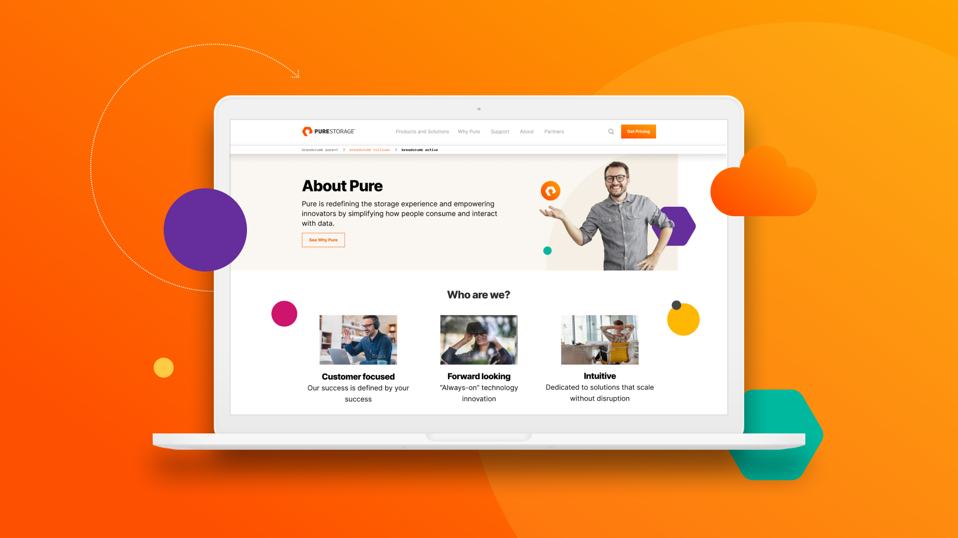
For the Brand and Digital Marketing team, everything we do is an opportunity for us to demonstrate customer obsession—our messaging, imagery, marketing, and digital platforms where our customers engage with us. Which is precisely why we had to do what every busy marketing team dreads: Admit it was time for our site to be better.
Our new site needed to mirror our company, but this wouldn’t be a vanity project or a simple reskinning—it had to be a total rebuild to create the kind of resource our customers want and need.
Customer Obsession 101: Let Your Customers Be Your Guide
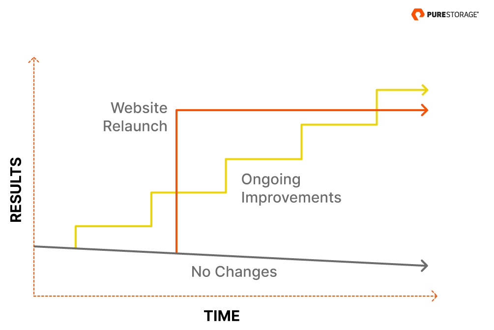
As Andy Crestodina, CMO of Orbit Media notes, “Every website must be redesigned eventually. Technology changes. Visitor expectations change. And if a website stays still, the performance of it slowly erodes.” It’s why many companies refresh their sites every three to five years—and why every redesign needs to start with getting inside your users’ psychology.
To do that, we used design thinking to uncover our customers’ key problems, wants, and needs. Design thinking is pretty amazing. It can help any team design with more meaning—whether it’s a city park, a toothbrush, a hospital, or a website. It’s meant to solve problems with design and, when done right, it can facilitate the kind of innovation that makes users feel like you’re reading their minds.
Ideally, you’ll end up with a proven winner before you’ve even gone to production. This is key when most of us are under tight timelines, and it’s critical when your goal is to exceed customer expectations.
For us, it was a natural vein to tap before we tackled three important areas: our information architecture (IA), search engine optimization (SEO), and the user interface (UI).
Your IA Is More Than a Menu. It’s Your Recipe for Success
As Pure expanded over the years from a hardware company to a software company as well, the site developed a bit of an identity crisis. It’s easier to bolt on new pages as business evolves instead of totally restructuring. But as we grew, we’d accumulated 22 different product pages.
The new IA would need to clearly articulate who we are now.
“Every website needs to do several things well or it fails. It needs to attract visitors, usually from search. It needs to convert visitors through visitor psychology, clarity of messaging, and usability. It needs to be easy to update. It needs to be beautiful and on-brand.” –Andy Crestodina, Orbit Media
We partnered with Power Digital Marketing to conduct user research and a series of card-sorting and tree-testing sessions to better understand how users categorized information so we could match our IA to their mental models. This gave us outside perspective and insights for our IA mapping exercise and guidance for relationships between the pages.
The result: Twenty-two pages became nine. Users can now easily find what they’re looking for and discover related content in a very natural way. And search engines can, too.
Proactively Address SEO at Every Stage
We live in a search-engine-driven world. Success or failure in business today is often directly proportional to search result rankings. So how do you balance two priorities: users and search engines? If your IA is excellent, you’ll accomplish both.
A website is an organization’s largest digital asset. It’s critical to optimize it from the ground up to maximize incoming traffic. Sites with a clearly defined and effective site structure not only give users exactly what they’re looking for but also perform better in search results.
To avoid missing any opportunities, we conducted SEO research early on to surface what people are looking for and then applied that to our IA and all subsequent content. This customer-focused approach, plus the strategic use of graphics and navigational cues, helps to reduce bounce rates, prop up rank, and build search engine links while reflecting exactly who we are as a company.
Don’t let SEO become an afterthought: Your site ranking will reflect it. Proactive SEO strategies can ensure you:
- Improve engagement and communication with various audiences
- Create the right kind of content and organize it intuitively
- Avoid missing the mark—and having to figure out why after the fact
- Optimize search efficiency by organizing and structuring content for crawling, thus improving your visibility on search engine results pages
Learn to Collaborate on UI Design Remotely
If your site isn’t easy to navigate, users are likely to assume working with you won’t be easy either. Pure customers love our simple storage solutions so much that to some it can feel like it gives them superpowers. We wanted to inspire that feeling on our site.
“Intuitive design is how we give the user new superpowers.” –Jared Spool
These guiding principles were at the forefront of every design decision we made. At each step we asked ourselves, “How can we make this complex interaction simple? How can we make it more intuitive for humans?” This also influenced design decisions such as a new, secondary color palette and typefaces. A neutral canvas background color minimizes stark, white-on-black contrast to improve legibility, and wayfinding elements are used with purpose, not whimsy.
Perhaps most important: We used web-based UI-design tool Figma to collaborate remotely on the redesign. Think Photoshop but with a file structure like Google Docs. This meant no more site-FINAL-Latest.psd file versioning issues. That was a big deal. Our lead designer said, “I can’t even begin to wrap my mind around how this would have gone with file handoffs.”
The tool also helps designers and developers stay aligned throughout the process, which is a game-changer with the complexities of responsive design. For us, Figma was the difference between launching the site now and six months from now. When we’re all working from home, it gave the entire team a super-accessible way to weigh in—like looking over a designer’s shoulder, but better.
If Content Is Royalty, Give It a Throne
Blogs and FAQ pages might take a backseat to homepages and portfolios, but that can be a mistake. Case in point: at Pure, more than 24% of our web traffic comes through our blog.
Ideally, content will serve a dual purpose: to answer top search queries and to give customers high-quality, educational content. Doing this nurtures a natural, value-added conversion funnel for users—customer-centricity at its best. For us, that’s content that leverages our industry expertise and value propositions to answer our audience’s questions and pain points. In other words, “unicorn content.”
So, how do you home in on the best content your site should serve up? SEO research should absolutely help you surface up unicorn content, but don’t stop there.
Content guru Larry Kim suggests mining Quora for relevant topics, blog post ideas, and FAQ page content. “Quora is an underrated goldmine of content treasures,” he notes. “You’ll find common questions as well as deep inquiries you may not have thought of before. You might even learn something about the topic yourself.” Follow relevant hashtags on social; subscribe to industry blogs; and scour Facebook, Reddit, and video channels for topics that are generating buzz.
For our refresh, two robust content channels got top priority: Pure Knowledge, which serves up educational content, and our company blog. We were sure to structure certain content into schemas for rich snippet results, and overhauled our blog to better engage visitors and serve up related content. Use a redesign as a chance to reevaluate your categorization and tagging strategies to ensure they reflect your current business, and to improve UX and your ability to gather metrics.
Look at Your Redesign as Both a Journey and a Destination
“The pillars of Pure’s Modern Data Experience—simple, seamless, fast, and future-ready—link the site experience to the product experience and give visitors a glimpse of how we think about products and solutions.” Lisa Oda, Creative Content
Design thinking has a way of unearthing more than you’d expect. In her article “Why Design Thinking Works,” Jeanne Liedtka notes, “In most organizations, design thinking involves seven activities. Each generates a clear output that the next activity converts to another output… [but] at a deeper level, something else is happening—something that executives generally are not aware of.”
Liedtka explains, “Though ostensibly geared to understanding and molding the experiences of customers, each design-thinking activity also reshapes the experiences of the innovators themselves in profound ways.”
That’s the thing about a website redesign. It’s both journey and destination. You’re orchestrating change throughout the planning process while keeping an eye on deliverables and milestones.
What surprised us most? It wasn’t the new components or the updated graphics—although impressive, for sure—but what happened along the way. The people and team who banded together made something magical. I like to think we’ve come out the other side as a better, bolder team with even more confidence to tackle the next big thing.
Our site redesign may be complete, but the job of creating phenomenal customer experiences is never done. We’re more excited than ever to see the next round of awesome innovation here at Pure.
Welcome to purestorage.com!
![]()


