The full potential of Elasticsearch and Kibana is exposed to the end-user as part of your Pure1 Unplugged deployment. Kibana is particularly exciting as it vastly expands the number of ways you can monitor and analyze your array’s data; it provides a simple user-friendly interface to create custom visualizations, such as simple number displays, tables, line charts, and heat maps. There are many default views provided that will be useful as part of most deployments, but if you’d like to expand your repertoire of visualizations for a different look at things, this post will dig a bit deeper into how you can do that as well. Note that this will assume you already have Pure1 Unplugged installed in your datacenter with at least one array already registered.
Your First Visualization
To kick things off, let’s start with a super simple visualization. To head to Kibana, navigate to https://[your deployment address]/kibana in a browser (or there are links to it at the bottom of existing Kibana dashboards). This should bring you to the Kibana homepage. Go ahead and take a look around, there are many useful features:
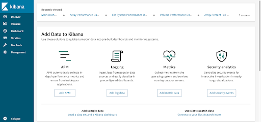
- The “Discover” tab provides a good way to take a quick look at the data being collected, such as the registered devices and the various metrics.
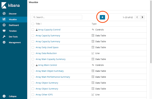
- The “Visualize” tab is where you create new visualizations or modify existing ones. Here you can see all the visualizations that come shipped with Pure1 Unplugged by default. You can also modify the default visualizations as per your needs.
- The “Dashboard” tab is the next layer above the visualizations; a dashboard is simply a collection of visualizations arranged in a grid. This is useful for getting a more overall view of your data. Here you can also see and modify the default dashboards that are shipped.
- The “Dev Tools” tab is great if you want to really get dirty with Kibana and Elasticsearch. This is a console for manually running Elasticsearch queries, which is another good way to explore the data or do some quick number crunching.
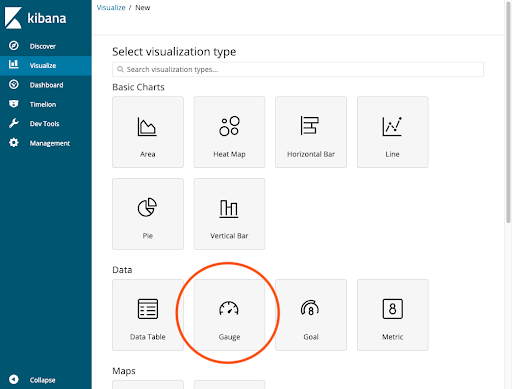
With that quick summary, let’s go ahead and make a simple gauge showing the write bandwidth for all of your devices. This may not be the most “useful” chart as there are already others showing this data in a better format, but it’s a good learning example.
To do this, jump into the “Visualize” tab and click on the blue plus icon at the top of the list.
For our first simple visualization, select the “Gauge” type, and then select “pure-arrays-metrics-*” on the next page.
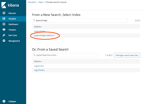 This is to specify that we want to look at array time-series metrics (as opposed to volume/filesystem metrics or the array registration index). You should then be presented with a page like this:
Most of the work we’ll be doing is on the sidebar on the left. The first thing we want to do is to show a gauge per device, instead of one gauge for the whole fleet (although you could do this too, that’s up to you!). Under “Buckets,” click “Split Group.”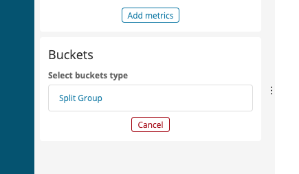 Then, under “Select an aggregation,” select “Terms.” For “Field,” you’ll want to scroll down to “DisplayName.” This is the name you set when you registered the device. We also provide access to the name registered on the array itself if you so desire, this field is called “ArrayName.”

To see what this “Split Group” did, click the blue play button at the top of the sidebar.
If you have only one array, nothing changed, but if you have two or more, then congrats! Things just got a bit more interesting. In our case, we have four.
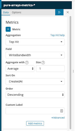
 The metrics that the gauges are displaying are not super helpful yet but that’s only because we haven’t told the visualization to display a specific field. So let’s get to displaying something useful! Click the arrow next to “Metric” in the “Metrics” section.

This is where we specify the “Y axis” (if you can call it that) of our visualization. If you did a line plot it would literally be the Y axis, or if you did a heat map it would be how “hot” a given cell is. This also explains why our gauges are so boring right now: it’s literally just displaying how many time series metrics we have in the current time range (the last 15 minutes by default).
Next, click on “Count” and instead change it to “Top Hit.” We’re using “Top Hit” because we only want the latest data point. In Field, select whatever numerical field you want: I’m going to pick “WriteBandwidth.” For “Aggregate with” select “Average,” and leave the size at 1, then change “Sort On” to “Created At.” This essentially means that we’re going to pick the latest data point (“sorting by the time of the metric, averaging the top one”). Your metric fields should look similar to this.
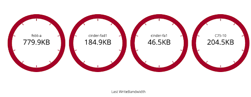
Go ahead and click the blue play button again to update the visualization. If you have a relatively unused device, it may show an empty gauge at zero, but in our case, we have arrays in use and as a result we see the view in the screenshot below.

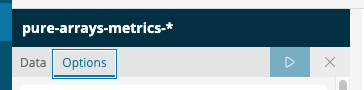
It’s showing the right data, but needs to be put in the right format too: the gauge doesn’t have nearly enough range to fit the data we have, and because of that they’re all panicking and red! Luckily, now that the visualization itself is done, making it look pretty is super easy. At the top of the sidebar, go to “Options.”
There are lots of options to tweak here. You can make the gauge circular instead of an arc…
Set the dials to stack vertically instead of horizontally….
![]()

Add sub text below every gauge…
![]()
 And many others. What we’re interested in though from a functional standpoint is the “Ranges” section. Here you can add all the different color sections to accentuate different values. In my case, I went with “0 to 600000”, “600000 to 700000”, and “700000 to 1000000,” but these numbers can vary depending on your specific needs as well as any conditions you want to watch out for.


There we go, that’s a much more palatable set of gauges to look at! Go ahead and click “Save” near the top of the page and enter a name.

Modifying a Dashboard
Now that we have this visualization, let’s put it somewhere so you can see it more easily. Click on “Dashboard” in the sidebar. Let’s go ahead and add this to the “Main Dashboard,” so go ahead and click that one.

After it opens, you should be presented with the dashboard you usually see. Let’s go ahead and click “Edit” at the top of the page. The dashboard should look about the same, but you can now resize and drag visualizations to better suit your needs.

To add our new visualization, click “Add” at the top of the page, then enter the name of your visualization from earlier. Click the name to add it, then you can close the “Add” dialog. Scroll down and you’ll find the visualization at the bottom of the dashboard. For better viewing as well as not needing to scroll, let’s drag the new visualization to just below the existing gauges.

In order to have this updated dashboard show up in the Pure1 Unplugged web UI, we’ll have to save it. Click “Save” at the top of the page. There are two main things to watch out for. First, leave “Save as a new dashboard” unchecked. This is useful if you wanted to create a new dashboard to experiment with, but wouldn’t change the existing one. Second, leave “Store time with dashboard” checked. This makes it so that the dashboard will use its own time range, instead of the time range of its container. For example, if you set the dashboard to use “last 15 minutes,” it will always use the last 15 minutes of data, even if it’s in a place that defaults to 24 hours. In the upper-right, there’s a selector for the time period you want to view. If you want to change this you can, to make a dashboard cover a longer/shorter time period.
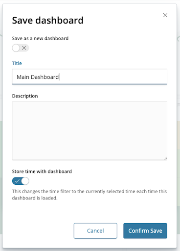
Go ahead and “Confirm Save.” Now, if you go back to the Pure1 Unplugged web UI and navigate to the dashboard (or you can go to https://[deployment address]/dash/dashboard), you should see your new visualization!
Now obviously this is just scratching the surface of what you can accomplish with Kibana. It is a massive project used around the world, and people have found no limit to the use they can get out of it.
We greatly look forward to hearing about what you get up to with the powerful combination of Pure1 Unplugged and Kibana. Thanks for reading, and happy monitoring!
If you’d like to read more about Pure1 Unplugged, you should check out the Pure1 Unplugged Disconnected Infrastructure Monitoring blog post.